Your website should be your biggest sales tool, but common design mistakes are costing you customers and revenue every day. This guide is for business owners, entrepreneurs, and marketers who want to stop losing potential customers to preventable website issues.
These 7 website design mistakes kill your business growth by driving visitors away before they can discover what you offer. We’ll show you how poor mobile responsiveness immediately turns away 60% of your potential customers, and why slow loading speeds create instant exits that cost you money. You’ll also learn how confusing navigation and weak call-to-action buttons prevent visitors from taking the next step with your business.
Each mistake damages your bottom line, but the good news is they’re all fixable. Let’s dive into the specific problems holding your website back and the solutions that will turn more visitors into paying customers.
Poor Mobile Responsiveness Drives Away 60% of Your Potential Customers
Mobile traffic accounts for majority of web browsing today
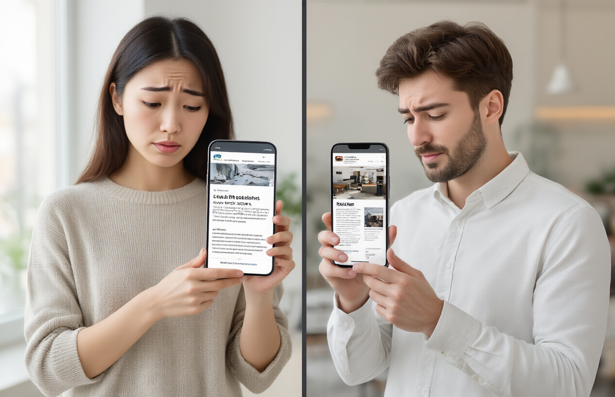
More than half of all website visits now come from mobile devices, with smartphones and tablets accounting for approximately 54% of global web traffic. This shift represents a complete transformation in how people access information, shop, and interact with businesses online. Your customers are browsing your website during their commute, while waiting in line, or relaxing at home on their couch.
The mobile-first approach has become the standard expectation rather than a nice-to-have feature. Users seamlessly switch between devices throughout their day, starting a purchase on their phone during lunch break and completing it on their laptop at home. If your website fails to provide a consistent, optimized experience across all devices, you’re essentially turning away the majority of your potential customers before they even see what you offer.
Google penalizes non-mobile-friendly sites in search rankings
Google’s mobile-first indexing means the search giant primarily uses the mobile version of your website for ranking and indexing purposes. Sites that aren’t mobile-optimized face significant drops in search visibility, often falling several pages down in search results where virtually nobody looks.
The algorithm specifically evaluates factors like:
- Page loading speed on mobile devices
- Text readability without zooming
- Touch-friendly button spacing
- Proper viewport configuration
- Avoidance of incompatible software like Flash
Websites that score poorly on Google’s Mobile-Friendly Test face ranking penalties that can devastate organic traffic. This creates a cascading effect where poor mobile responsiveness leads to lower search visibility, which directly translates to fewer visitors and lost revenue opportunities.
Users abandon sites that don’t load properly on their devices
The average mobile user expects a website to load within three seconds, and 53% will abandon a page that takes longer. When visitors encounter broken layouts, tiny text requiring constant zooming, or buttons too small to tap accurately, they don’t stick around to figure it out.
Common mobile responsiveness issues that drive users away include:
- Horizontal scrolling that forces users to swipe left and right to view content
- Overlapping elements that make text unreadable or buttons inaccessible
- Pop-ups that can’t be closed on smaller screens
- Images that don’t scale properly and break page layouts
- Form fields that are impossible to fill out on touch keyboards
Users have countless alternatives available with just a few taps. When your site creates friction, they simply hit the back button and choose a competitor whose website works seamlessly on their device.
Revenue loss from mobile users unable to complete purchases
E-commerce businesses suffer the most dramatic impact from poor mobile responsiveness. Mobile commerce now represents over 40% of all online sales, yet many websites still provide subpar mobile checkout experiences that actively prevent conversions.
Shopping cart abandonment rates on mobile devices reach as high as 85% when sites aren’t properly optimized. Customers struggle with:
| Mobile Commerce Barriers | Impact on Sales |
|---|---|
| Difficult checkout forms | 27% abandon purchase |
| Payment button issues | 18% conversion loss |
| Poor product image viewing | 23% reduced engagement |
| Slow loading during checkout | 32% cart abandonment |
Consider a local restaurant with a non-responsive website. Hungry customers trying to view the menu or place an order from their phones encounter tiny, unreadable text and broken ordering systems. They quickly move on to competitors with mobile-optimized sites, representing direct revenue loss that compounds daily.
Service-based businesses lose leads when contact forms don’t function properly on mobile devices, or when potential clients can’t easily find phone numbers and addresses. Every mobile user who can’t complete their intended action represents lost revenue that flows directly to competitors who prioritized mobile responsiveness.
Slow Loading Speed Creates Immediate Customer Exit

Users expect pages to load within 3 seconds or less
Your website visitors live in a world of instant gratification. When someone clicks on your site, they’re already mentally preparing to engage with your content or make a purchase. That three-second window represents their patience threshold – cross it, and you’ve likely lost them forever.
Research from Google shows that 53% of mobile users abandon sites that take longer than three seconds to load. Think about your own browsing habits: when was the last time you waited more than a few seconds for a slow website? You probably hit the back button and found a competitor’s site instead.
The psychology behind this behavior is simple. Users associate slow-loading websites with poor quality, unreliability, and outdated technology. Your potential customers don’t just leave because they’re impatient – they leave because your slow site creates doubt about your entire business operation.
Each second of delay reduces conversion rates by 7%
The financial impact of slow loading speeds hits your bottom line harder than most business owners realize. Every additional second your pages take to load costs you real money through lost conversions.
Amazon discovered that every 100-millisecond delay in page load time decreased their sales by 1%. For a company generating billions in revenue, those milliseconds translate to millions in lost profits. Your business might operate on a smaller scale, but the percentage impact remains consistent.
Here’s what different loading speeds mean for your conversion rates:
| Page Load Time | Conversion Rate Impact | Customer Experience |
|---|---|---|
| 1-2 seconds | Baseline performance | Excellent user experience |
| 3 seconds | 7% reduction | Acceptable but noticeable |
| 4 seconds | 14% reduction | Frustrating delays |
| 5+ seconds | 21%+ reduction | Most users abandon |
The compound effect becomes devastating over time. A site that takes five seconds to load instead of two seconds could be losing over 20% of potential sales. For a business generating $100,000 annually, that represents $20,000 in lost revenue – enough to fund significant website improvements.
Page speed directly impacts search engine optimization rankings
Google treats page speed as a critical ranking factor because search engines prioritize user experience above everything else. When your site loads slowly, Google interprets this as providing a poor experience to searchers, which pushes your rankings down.
The search giant’s algorithm considers multiple speed-related metrics:
- First Contentful Paint: How quickly users see the first piece of content
- Largest Contentful Paint: When the main content becomes visible
- Cumulative Layout Shift: How much your page elements move around while loading
- First Input Delay: How quickly your site responds to user interactions
Slower sites get buried deeper in search results, creating a vicious cycle. Poor rankings mean less organic traffic, which means fewer opportunities to convert visitors into customers. Your competitors with faster-loading sites capture the traffic and sales that should be yours.
Mobile page speed carries even more weight since Google switched to mobile-first indexing. Your site’s mobile loading speed now determines your desktop search rankings too. This shift makes speed optimization essential for maintaining visibility in search results across all devices.
Confusing Navigation Prevents Users from Finding What They Need

Complex menu structures frustrate potential customers
When your website menu reads like a corporate organizational chart, visitors bounce faster than a rubber ball. Complicated dropdown menus with three or four levels deep create decision paralysis. Users shouldn’t need a roadmap to find your pricing page or contact form.
Take a look at your current navigation. If you have categories like “Solutions > Enterprise > Industry-Specific > Healthcare > Patient Management,” you’ve gone too far. Most successful websites stick to 5-7 main menu items maximum. Each click adds friction, and friction kills conversions.
The worst offenders use confusing labels that sound important but mean nothing. “Strategic Solutions” or “Innovative Services” tell visitors absolutely nothing about what you actually do. Clear, descriptive labels like “Web Design,” “Pricing,” and “About Us” work because people instantly understand them.
Missing search functionality forces users to leave
Every website with more than a dozen pages needs a search bar. Period. When users can’t find what they’re looking for in your navigation, they’ll try searching for it. If that option doesn’t exist, they’ll search for your competitor instead.
Search functionality becomes critical for e-commerce sites, blogs, and service-based businesses with multiple offerings. Users might know exactly what they want but have no idea which category you’ve buried it under. A prominent search bar gives them a direct path to their goal.
The search bar should be visible on every page, preferably in the header. Make it functional with auto-suggestions and spell-check capabilities. A broken or useless search feature is worse than no search at all.
Poor information architecture hides your best content
Your website’s information architecture is like the foundation of a house – invisible but absolutely critical. Poor organization buries your most valuable content where nobody will ever find it. Your best case studies, testimonials, and service descriptions get lost in a maze of random pages and illogical groupings.
Start with user intent, not your internal company structure. Visitors don’t care that your marketing department handles both social media and print advertising. They care about solving their specific problem. Group related content together based on what users actually want to accomplish.
Create logical content hierarchies that follow the customer journey. Someone researching solutions should easily find your service pages, then pricing, then testimonials, then contact information. Each step should naturally lead to the next without forcing users to hunt through unrelated sections.
Broken internal links damage user experience
Nothing screams “unprofessional” like clicking a link and landing on a 404 error page. Broken internal links frustrate users and signal to search engines that your site isn’t well-maintained. These dead ends interrupt the user journey and often send visitors straight to your competitors.
Regular link audits should be part of your website maintenance routine. Use tools like Google Search Console or specialized link checkers to identify broken links before they damage user experience. Pay special attention to links in your main navigation, footer, and key landing pages.
When you do find broken links, fix them immediately. Redirect old URLs to relevant new pages rather than deleting them entirely. This maintains both user experience and any SEO value those pages had built up over time.
Weak Call-to-Action Buttons Fail to Convert Visitors into Customers

Generic Button Text Reduces Click-Through Rates
Your call-to-action buttons speak directly to your visitors’ willingness to engage with your business. When you use bland, generic phrases like “Click Here,” “Submit,” or “Learn More,” you’re missing a massive opportunity to drive conversions. These vague terms tell users nothing about what they’ll gain from taking action.
Effective CTA buttons use action-oriented language that clearly communicates value. Instead of “Submit,” try “Get Your Free Quote” or “Download Your Marketing Guide.” Replace “Learn More” with “Discover How to Double Your Sales” or “See Pricing Options.” The difference in conversion rates can be dramatic – studies show that personalized, benefit-focused button text can increase clicks by up to 42%.
Your button text should answer the question “What’s in it for me?” The moment a visitor sees your CTA, they should instantly understand what they’ll receive and why it matters to them.
Poor Placement Makes CTAs Invisible to Users
Even the most compelling call-to-action becomes worthless if nobody sees it. Many websites bury their CTAs below the fold, hide them in cluttered sidebars, or place them where users don’t naturally look.
The most effective CTA placement follows user behavior patterns. Your primary call-to-action should appear above the fold on every important page. Place secondary CTAs at natural stopping points in your content – after explaining a key benefit, at the end of product descriptions, or following customer testimonials.
Consider the F-pattern reading behavior: users scan horizontally at the top of pages, then make shorter horizontal movements down the left side. Position your CTAs to intersect these natural eye movement patterns. Heat map studies consistently show that CTAs placed in the upper right corner of pages and at the end of content sections receive the highest engagement rates.
Lack of Urgency Fails to Motivate Immediate Action
Without urgency, visitors bookmark your page with good intentions but never return. Creating legitimate urgency transforms browsers into buyers by tapping into the psychological principle of loss aversion – people hate missing out on opportunities.
Time-sensitive offers work exceptionally well: “Sale Ends Friday” or “Only 48 Hours Left” create natural deadlines. Limited quantity messages like “Only 3 Spots Remaining” or “While Supplies Last” trigger scarcity psychology. However, avoid false urgency that damages trust – make sure your limited-time offers are genuine.
You can also create urgency through consequence-focused messaging. Instead of “Sign Up Today,” try “Don’t Miss Out on Higher Rankings” or “Secure Your Competitive Advantage Now.” This approach emphasizes what visitors lose by waiting rather than what they gain by acting immediately.
Too Many Competing CTAs Confuse Decision-Making
Analysis paralysis kills conversions faster than almost any other website mistake. When you present visitors with multiple calls-to-action on a single page, you force them to make complex decisions about which action serves their needs best. Most people respond to this confusion by taking no action at all.
Apply the principle of singular focus: each page should have one primary call-to-action that supports your main business objective. If you must include secondary CTAs, make them visually subordinate through smaller sizes, muted colors, or less prominent placement.
Create a clear visual hierarchy that guides users naturally toward your most important action. Your primary CTA should use your brand’s accent color, while secondary options use neutral tones. The size difference should be obvious – your main CTA button should be at least 25% larger than alternatives.
Test different CTA combinations to find your optimal balance. Some businesses discover that removing competing elements increases their primary conversion rate by over 35%, even though they’re offering fewer options to visitors.
Outdated Design Elements Make Your Business Look Unprofessional
Old color schemes and fonts signal lack of innovation
Your website’s visual elements speak volumes before visitors even read your content. When you’re still using Comic Sans font or bright neon color combinations from the early 2000s, potential customers immediately question your business’s credibility and staying power. Modern users expect clean, contemporary design that reflects current trends and professional standards.
Typography choices particularly impact perception. Outdated serif fonts like Times New Roman or decorative fonts that were popular years ago make your site look like it hasn’t been updated since its launch. Current design trends favor clean, readable fonts like Inter, Poppins, or system fonts that enhance user experience across all devices.
Color schemes also reveal your design age. Gradients that were trendy in 2010, overly bright backgrounds, or color combinations that clash tell visitors your business might not be keeping up with industry standards. Modern color palettes tend toward sophisticated combinations with plenty of white space, muted tones, or bold but strategic accent colors.
| Outdated Elements | Modern Alternatives |
|---|---|
| Comic Sans, Papyrus fonts | Inter, Roboto, System fonts |
| Bright neon backgrounds | Clean whites, subtle grays |
| Heavy drop shadows | Subtle shadows, flat design |
| Animated GIFs everywhere | Strategic micro-animations |
Poor visual hierarchy makes content difficult to scan
Visual hierarchy guides visitors through your content naturally, but outdated design approaches often ignore this critical principle. When everything on your page competes for attention equally, users can’t quickly identify what matters most. Poor hierarchy typically shows up as uniform text sizes, lack of proper heading structures, or cramped layouts without sufficient white space.
Users scan web content in predictable patterns, typically following an F-shaped or Z-shaped reading flow. Outdated designs interrupt these natural patterns by placing important information in low-visibility areas or failing to use size, color, and positioning to create clear content paths.
Effective hierarchy starts with your headings. Using the same font size for main headlines and subheadings confuses readers about content importance. Modern designs employ clear size differences, strategic font weights, and consistent spacing to create scannable content that users can quickly navigate.
White space plays a huge role in hierarchy but older designs often cram too much content into limited space. Current best practices embrace generous margins, proper line spacing, and breathing room around important elements like call-to-action buttons or key messages.
Inconsistent branding reduces trust and credibility
Brand consistency across your website builds recognition and trust, but many businesses inadvertently damage their credibility through inconsistent design elements. When your logo appears in different sizes or colors across pages, or when fonts and color schemes vary throughout your site, visitors question your attention to detail and professional standards.
Inconsistency often happens gradually as businesses add content or make quick fixes without considering overall brand guidelines. Different team members might upload images with varying styles, use different button colors, or apply inconsistent spacing. These small variations accumulate into a disjointed user experience that feels unprofessional.
Your brand elements should remain constant across every page:
- Logo placement and sizing
- Color palette application
- Font choices and sizes
- Button styles and spacing
- Image treatment and filters
- Voice and tone in copy
Professional websites maintain strict design standards that reinforce brand identity. When visitors move between your homepage, product pages, and contact forms, they should experience seamless visual continuity that builds confidence in your business’s reliability and attention to quality.
Missing or Insufficient Contact Information Loses Sales Opportunities

Hidden contact details prevent customer inquiries
Your potential customers are ready to buy, but they can’t find your phone number. This scenario plays out thousands of times daily across poorly designed websites. When contact information is buried in footer text or hidden behind multiple clicks, you’re essentially putting up barriers between interested prospects and sales.
Many businesses make the critical error of treating contact details as secondary information. They tuck phone numbers into tiny footer fonts, bury email addresses in obscure “About” pages, or worse—force visitors to fill out lengthy contact forms just to ask a simple question. Every extra step you add reduces the likelihood of customer contact by approximately 20%.
Smart businesses prominently display their primary contact method above the fold. Whether that’s a phone number in the header, a chat widget, or a clearly visible “Contact Us” button, accessibility drives conversions. Consider this: a visitor spending 30 seconds searching for your contact information is a visitor who might abandon your site altogether.
Lack of multiple communication channels limits accessibility
Different customers prefer different communication methods. While some people love picking up the phone, others prefer email, live chat, or even text messaging. Limiting yourself to just one contact method means missing out on entire customer segments.
Generation gaps play a huge role here. Baby boomers often prefer phone calls, while millennials and Gen Z gravitate toward instant messaging platforms. Business professionals might prefer email for detailed inquiries, while urgent questions call for phone or chat options.
Here’s what comprehensive contact coverage looks like:
- Phone number for immediate assistance
- Email address for detailed inquiries
- Live chat for quick questions
- Contact form for structured requests
- Business address for local credibility
- Social media handles for casual engagement
Companies offering multiple contact channels see 23% higher customer satisfaction rates and 18% more qualified leads compared to single-channel businesses.
Missing location information hurts local business credibility
Local customers need to know where you are. Even if you operate an online business, displaying location information builds trust and legitimacy. Visitors want to know they’re dealing with a real company, not some fly-by-night operation.
Physical addresses serve multiple purposes beyond customer visits. They improve local SEO rankings, build regional credibility, and provide reassurance to hesitant buyers. A clear address signals stability and permanence—qualities that encourage customer confidence.
Don’t just list your address in plain text. Make it clickable so mobile users can easily get directions. Include landmarks or nearby businesses to help people find you. If you serve specific geographic areas, clearly state your service zones to manage expectations and improve local search visibility.
Absent social proof reduces visitor confidence
Contact sections offer perfect opportunities to display credibility indicators. Customer testimonials, review ratings, certifications, and trust badges all belong near your contact information because this is where visitors make their final decision to reach out.
Think about your own browsing behavior. Before contacting a business, you likely check their reviews, look for certifications, or scan for familiar trust symbols. Your visitors do the same thing. A contact section without social proof feels empty and unconvincing.
Effective social proof elements include:
| Element | Impact | Example |
|---|---|---|
| Customer reviews | 88% trust online reviews | Google/Yelp ratings |
| Trust badges | 61% check for security seals | SSL certificates, BBB logos |
| Contact response times | Sets expectations | “We respond within 2 hours” |
| Team photos | Humanizes your business | Staff headshots with names |
| Awards/certifications | Builds professional credibility | Industry recognition badges |
When visitors see real faces, genuine reviews, and professional credentials near your contact information, they’re 34% more likely to initiate contact compared to businesses without visible social proof.
Poor Content Organization Overwhelms and Confuses Your Audience

Information overload on homepage drives visitors away
Your homepage serves as the digital front door to your business, but cramming too much information onto it creates an instant barrier. When visitors land on your site and face walls of text, countless menu options, and multiple competing messages, their brains shut down. Studies show that users form an opinion about your website within 0.05 seconds – that’s faster than a blink.
Think about walking into a cluttered store where products are scattered everywhere, signs point in different directions, and you can’t find what you need. You’d leave immediately. The same happens online when your homepage tries to showcase every product, service, testimonial, and company achievement all at once.
Smart businesses follow the “rule of three” – presenting no more than three key messages or options on their homepage. Apple’s homepage typically features just one main product with minimal text. Amazon, despite selling millions of items, keeps their homepage clean with clear categories and a prominent search bar.
Break your content into digestible sections with plenty of white space. Use progressive disclosure – show the most important information first, then allow users to dive deeper if they want. Your homepage should answer three questions within seconds: what you do, who you serve, and what action visitors should take next.
Lack of clear value proposition fails to communicate benefits
Your value proposition represents the single most important element on your website, yet many businesses bury it in corporate jargon or skip it entirely. Visitors shouldn’t have to play detective to understand why they should choose you over competitors.
A weak value proposition sounds like: “We provide innovative solutions to help businesses achieve their goals.” This tells visitors absolutely nothing. A strong value proposition gets specific: “We help small restaurants increase delivery orders by 40% through optimized online ordering systems.”
Your value proposition should pass the “grandmother test” – if your grandmother can’t understand what you do and why it matters within 10 seconds of reading it, you need to simplify. Place this statement prominently on your homepage, ideally in the hero section where visitors look first.
Create urgency by highlighting the problem you solve rather than just listing features. Instead of “24/7 customer support,” try “Never lose another customer to unanswered questions – get help anytime, day or night.” This approach shows the pain point and positions your service as the solution.
Test different versions of your value proposition with real users. Ask them to visit your homepage for 5 seconds, then explain what your business does. Their answers will reveal whether your message hits the mark.
Missing or weak headlines reduce content engagement
Headlines act as the gatekeepers of your content – they determine whether visitors will continue reading or click away. Weak headlines like “About Us,” “Our Services,” or “Welcome to Our Website” waste valuable real estate and fail to capture attention.
Strong headlines trigger curiosity, promise benefits, or create urgency. Compare “Our Process” with “How We Cut Your Project Timeline in Half.” The second version immediately communicates value and makes readers want to learn more. Your headlines should work as mini-advertisements for the content that follows.
Use numbers when possible – they stand out visually and set clear expectations. “5 Ways to Reduce Energy Costs” performs better than “Energy Saving Tips.” Action words also boost engagement: “Transform,” “Discover,” “Unlock,” and “Master” all signal that readers will gain something valuable.
Structure your headlines hierarchically. Your main headline should be the most compelling, followed by subheadings that support and expand on the primary message. Each heading should be able to stand alone while contributing to the overall narrative flow.
Avoid clever wordplay or industry jargon in headlines. Your audience scrolls quickly and won’t pause to decode cryptic messages. Clear, direct headlines that immediately communicate benefit will always outperform creative but confusing alternatives. Test different headline variations to see which ones generate more clicks and engagement.
Your website serves as your business’s digital storefront, and these seven design mistakes can seriously damage your bottom line. Mobile responsiveness issues alone cost you 60% of potential customers, while slow loading speeds and confusing navigation push visitors away before they even see what you offer. When you combine weak call-to-action buttons, cluttered layouts, missing trust signals, and poor SEO practices, you’re essentially building roadblocks between your business and success.
The good news is that fixing these problems doesn’t require a complete website overhaul. Start by checking your mobile experience, speed up your loading times, and simplify your navigation. Add clear contact information, clean up your design, and make sure your call-to-action buttons actually guide visitors toward making a purchase. Your website should work for you, not against you – and addressing these common mistakes will help you turn more visitors into paying customers.

Saurabh Kumar is the founder of SaurabhOrbit.com, a hub for tech news, digital marketing insights, and expert blogging advice. With a deep passion for technology and digital strategies, Saurabh simplifies complex trends into actionable insights for readers looking to stay ahead in the digital world. My mission is to empower entrepreneurs, tech enthusiasts, and marketers with the latest tools and knowledge to thrive in the online space.