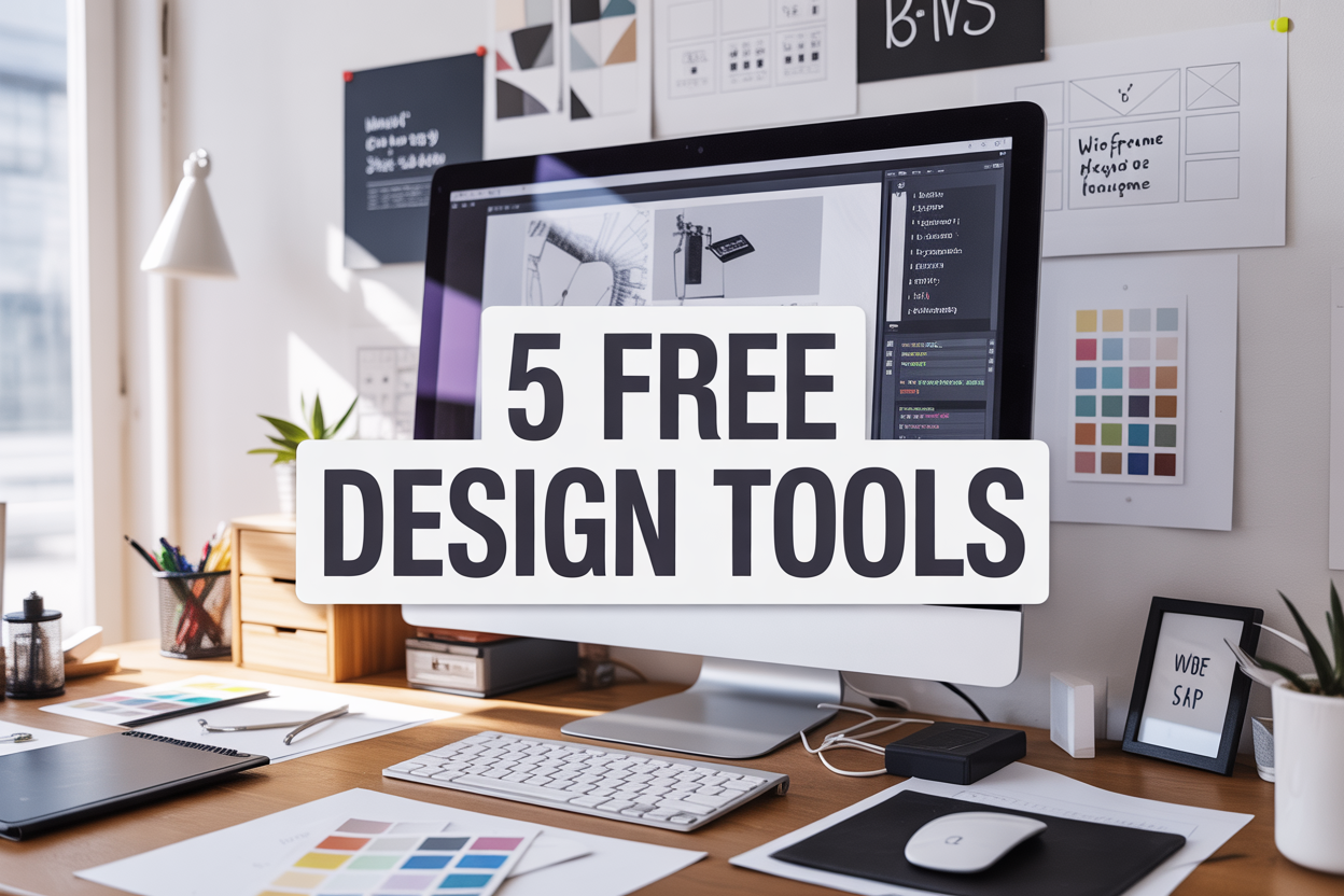
5 Free Tools Every Website Designer Must Know About
Website designers and developers constantly search for tools that speed up their workflow without breaking the bank. This guide covers five essential free resources that can transform how you approach web design projects.
You’ll discover wireframing tools that help you plan layouts before coding, plus color palette generators that take the guesswork out of choosing the right combinations. We’ll also explore typography resources for creating professional text designs and image editing tools that optimize your visuals for the web.
Wireframing and Prototyping Made Simple

Create professional layouts without design experience
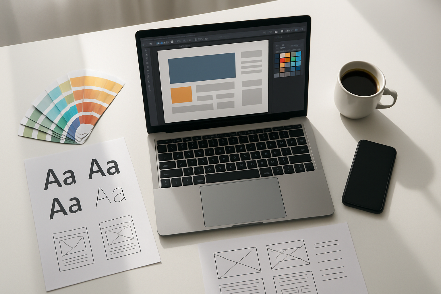
Figma stands out as the go-to wireframing tool that transforms complex design processes into intuitive drag-and-drop experiences. You don’t need years of design training to create clean, professional layouts. The platform offers pre-built UI components, templates, and design systems that serve as your foundation. Start with basic shapes and text boxes to map out your website structure, then gradually add detail as your vision develops.
Balsamiq takes a different approach with its sketchy, hand-drawn aesthetic that keeps focus on functionality over aesthetics during early planning stages. This deliberately rough style prevents clients from getting distracted by colors or fonts when you need feedback on layout and user experience.
Both tools feature extensive component libraries covering everything from navigation bars to contact forms. Smart guides and alignment tools ensure your wireframes look polished even if you’ve never touched design software before.
Test user flows before coding begins
Interactive prototyping reveals usability issues that static mockups miss entirely. Marvel excels at connecting your wireframe screens with clickable hotspots, creating realistic user journeys without writing a single line of code. You can simulate button clicks, page transitions, and form submissions to identify navigation problems early.
InVision offers similar functionality with additional collaboration features. Stakeholders can click through your prototype as if it were a real website, providing specific feedback on each interaction point. This hands-on experience often uncovers user experience flaws that would be expensive to fix after development begins.
Testing user flows at the prototype stage costs nothing but time, while fixing the same issues in live code requires substantial developer hours and potential database changes.
Share interactive mockups with clients instantly
Cloud-based sharing eliminates the back-and-forth email chaos that plagues traditional design reviews. Figma’s real-time collaboration means clients can view your latest changes immediately, leave comments directly on specific design elements, and watch your design process unfold live during video calls.
Adobe XD provides similar sharing capabilities with password protection and viewing permissions. Generate a shareable link that works on any device – clients can review your prototype on their phone during their commute or pull it up on their tablet during meetings.
Version control becomes automatic when everything lives in the cloud. Clients always see the most current iteration, and you can track which suggestions have been implemented versus those still pending review.
Save hours of revision time with visual planning
Visual wireframes catch layout issues that written specifications miss. When you can see exactly how navigation menus interact with content areas, spacing problems become obvious before any code gets written. Whimsical combines wireframing with flowchart capabilities, letting you map out complex user journeys alongside your page layouts.
Stakeholder alignment happens faster with visual references. Instead of explaining how the sidebar will work in paragraph form, show an interactive prototype where they can click and experience the functionality firsthand. This shared understanding reduces miscommunication that leads to expensive revision cycles.
Design systems developed during wireframing create consistency across your entire website. Define your button styles, spacing rules, and layout patterns once, then reuse them throughout your project. This systematic approach prevents the random design decisions that create visual chaos and require time-consuming fixes later.
Color Palette Generators for Perfect Combinations
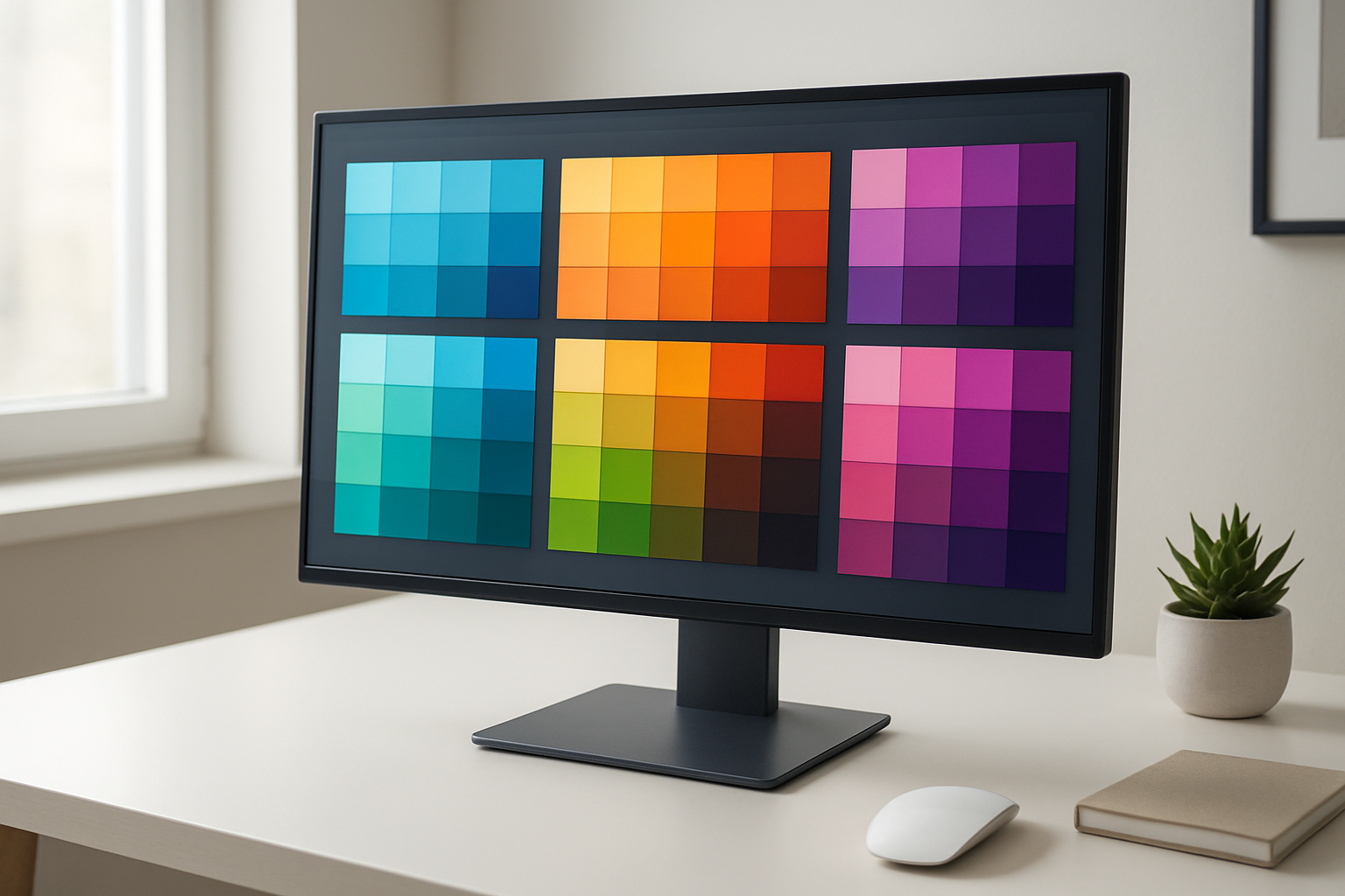
Generate harmonious color schemes automatically
Color palette generators have revolutionized how designers approach color selection, turning what was once a time-consuming guessing game into a streamlined process. These tools leverage color theory principles to create balanced, professional-looking combinations that work together naturally.
Adobe Color (formerly Kuler) stands out as the gold standard for automatic palette generation. Its intelligent algorithms create schemes based on complementary, triadic, monochromatic, and split-complementary relationships. You simply start with one base color, and the tool generates multiple variations that maintain visual harmony. The real magic happens with its rule-based approach—you can lock specific colors and let the generator adjust others, giving you control while still benefiting from automated assistance.
Coolors.co offers perhaps the most addictive palette generation experience available. Hit the spacebar, and watch as beautiful color combinations appear instantly. The tool lets you lock colors you love and regenerate only the ones you want to change. Its export options cover everything from CSS variables to Adobe Swatch Exchange files.
Paletton takes a more technical approach, showing color relationships on an interactive color wheel. This visual representation helps you understand why certain combinations work, making you a better designer in the process. The tool also provides accessibility information, showing how your colors perform for users with different types of color vision.
Extract colors from inspiring images and photos
Sometimes the perfect color palette already exists in nature, artwork, or photographs. Modern extraction tools can pull these hidden gems from any image, saving you from the impossible task of matching colors by eye.
Adobe Color’s camera feature transforms your smartphone into a palette extraction device. Point your camera at anything—a sunset, a vintage poster, a piece of fabric—and watch as it identifies the dominant colors and creates an instant palette. The tool even suggests alternative schemes based on the extracted colors.
Canva’s Color Palette Generator excels at photo analysis, offering clean, organized palettes from uploaded images. What sets it apart is its ability to provide both exact color matches and harmonious alternatives that complement the extracted palette. The interface shows you exactly where each color appears in the source image, making it easy to understand the relationship between colors and their context.
ImageColorPicker.com provides a straightforward approach to color extraction. Upload any image, and click anywhere to get precise hex codes. The tool maintains a history of your picked colors, making it easy to build custom palettes from multiple sources.
These extraction tools prove invaluable when you need to match existing brand elements or draw inspiration from specific imagery. They eliminate the guesswork and provide exact color values you can use immediately in your design software.
Ensure accessibility compliance with contrast checkers
Creating beautiful color combinations means nothing if your users can’t read your content. Accessibility compliance isn’t just about following guidelines—it’s about creating inclusive experiences that work for everyone.
WebAIM’s Contrast Checker remains the most trusted tool for WCAG compliance testing. Enter your foreground and background colors, and it instantly shows you whether your combination meets AA or AAA standards. The tool provides clear pass/fail results and suggests lightening or darkening adjustments when combinations fall short.
Colour Contrast Analyser by TPGi goes beyond basic checking by offering real-time feedback as you adjust colors. The desktop application shows you exactly how much you need to modify colors to achieve compliance, taking the guesswork out of accessibility fixes.
Stark has gained popularity among design teams for its Figma and Sketch integrations. This plugin checks contrast ratios directly within your design environment, flagging potential issues before they make it to development. The tool also simulates different types of color blindness, helping you understand how your designs appear to users with various visual conditions.
Smart designers build accessibility checking into their workflow from the beginning rather than treating it as an afterthought. These tools make compliance checking so simple that there’s no excuse for creating inaccessible color combinations. They often suggest alternative shades that maintain your design intent while meeting accessibility standards, proving that beautiful and accessible design aren’t mutually exclusive.
Typography Resources for Professional Text Design
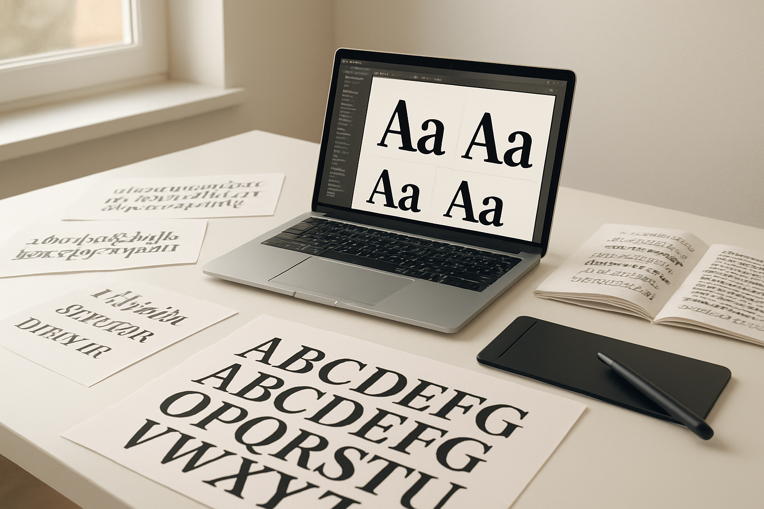
Access Thousands of Free Fonts for Any Project Style
Google Fonts stands as the go-to resource for web designers, offering over 1,400 font families completely free. The platform covers everything from elegant serifs for luxury brands to playful sans-serifs for modern startups. Each font comes with multiple weights and styles, giving you flexibility for headers, body text, and everything in between.
Font Squirrel provides another treasure trove of commercial-use fonts, carefully curated and legally safe for client projects. Their collection focuses on high-quality typefaces that work beautifully across different contexts. The site also offers a helpful web font generator that converts desktop fonts into web-ready formats.
DaFont caters to designers seeking unique, eye-catching display fonts perfect for logos and headlines. While the quality varies, you’ll find gems for specific themes like vintage, futuristic, or handwritten styles. Always check licensing terms before using these fonts in commercial projects.
Preview Font Combinations Before Implementing Them
Font pairing can make or break your design, and testing combinations saves countless hours of revision work. FontJoy uses machine learning to generate font combinations that actually work together, helping you discover unexpected pairings you might never have considered.
Google Fonts Preview Tool allows you to test multiple fonts simultaneously on sample text. You can adjust sizes, weights, and spacing while comparing how different combinations look together. This real-time preview prevents the common mistake of choosing fonts that clash when used in context.
Type Scale helps you establish consistent typography hierarchies by testing different font sizes and spacing ratios. The tool shows how your chosen fonts will look at various sizes, ensuring smooth visual flow from headlines to body text.
Optimize Text Readability Across All Devices
Responsive typography goes beyond simply scaling font sizes. WebAIM’s Color Contrast Checker ensures your text meets accessibility standards by testing color combinations for sufficient contrast ratios. This tool helps you create designs that work for users with visual impairments while improving readability for everyone.
Modular Scale generates harmonious font size progressions that look consistent across different screen sizes. By using mathematical ratios, you create typography that feels balanced whether viewed on a smartphone or desktop monitor.
Browser testing tools like BrowserStack let you preview your typography choices across different devices and browsers. Text rendering can vary significantly between Chrome and Safari or between iOS and Android, so testing prevents nasty surprises after launch.
Line height and character spacing adjustments become crucial for mobile readability. Tools like Gridlover help you establish vertical rhythm that works across breakpoints, ensuring your text remains comfortable to read regardless of device orientation or screen size.
Image Editing and Optimization Tools
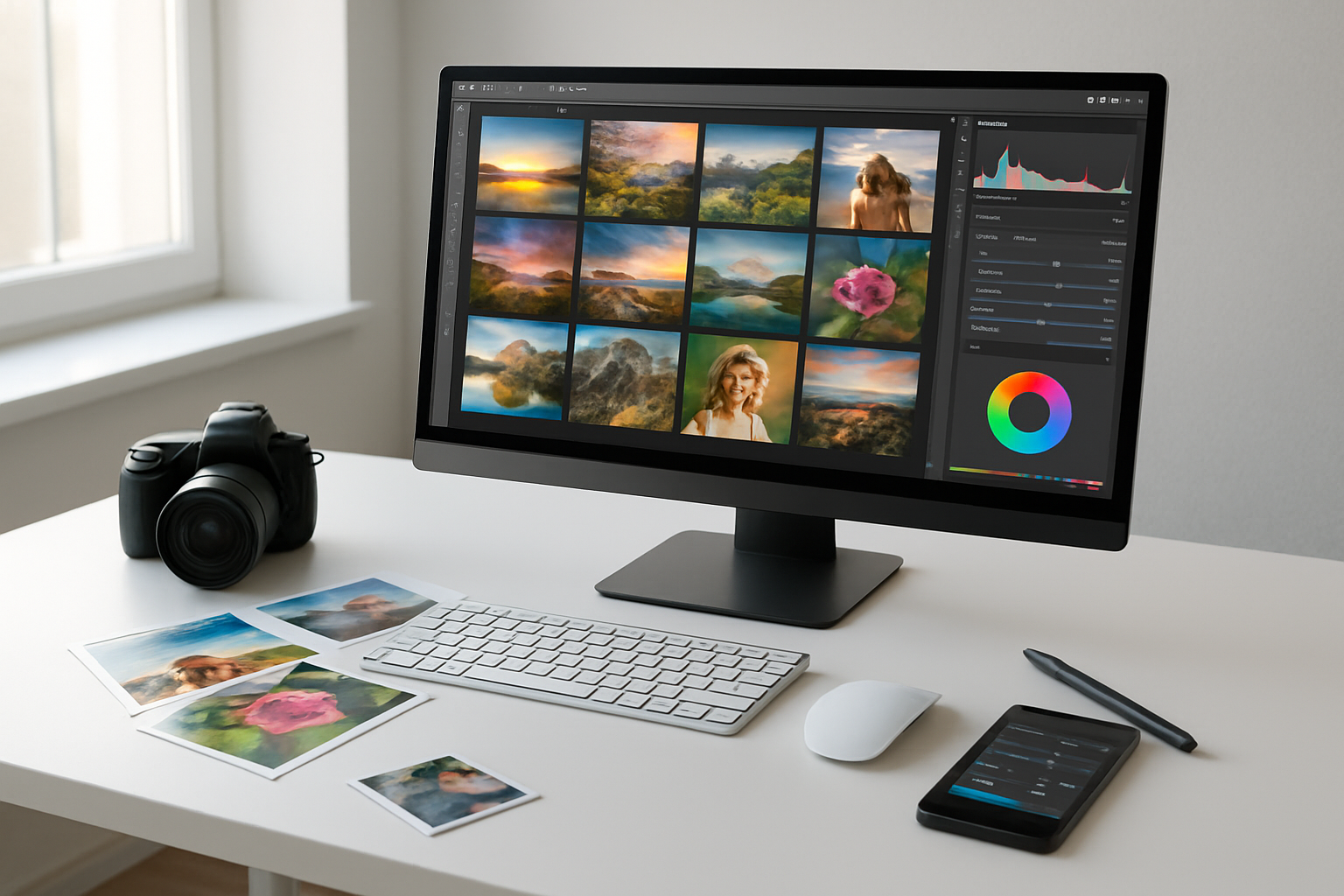
Remove backgrounds without Photoshop skills
Say goodbye to expensive software subscriptions for basic background removal tasks. Remove.bg stands out as the most reliable free tool that uses AI to automatically detect and remove backgrounds from images in seconds. Simply upload your photo, and the algorithm does the heavy lifting, delivering clean cutouts that rival professional editing work.
PhotoRoom offers another excellent option with its smart background removal feature, plus the bonus of adding custom backgrounds instantly. The tool works particularly well for product photography and portrait shots. For more control over the process, Canva’s Background Remover lets you fine-tune edges and make manual adjustments when the AI needs a helping hand.
| Tool | Best For | Key Feature |
|---|---|---|
| Remove.bg | People & objects | One-click removal |
| PhotoRoom | Product photos | Instant backgrounds |
| Canva | Manual control | Edge refinement |
Compress images for faster website loading
Website speed directly impacts user experience and search rankings, making image compression a non-negotiable skill. TinyPNG crushes file sizes by up to 70% while maintaining visual quality that’s virtually indistinguishable from the original. The tool supports both PNG and JPEG formats, processing up to 20 images simultaneously.
ImageOptim works differently by stripping unnecessary metadata and optimizing compression algorithms without touching image quality. This approach often yields better results than standard compression tools. For batch processing large quantities of images, Squoosh by Google provides advanced controls over compression settings, letting you compare before-and-after results in real-time.
Smart compression involves finding the sweet spot between file size and quality. Start with 80-85% quality for JPEG images and always test compressed images on actual devices to ensure they meet your standards.
Create custom graphics and icons easily
Building custom visual elements doesn’t require years of design training anymore. Canva provides thousands of templates, icons, and design elements that you can customize with your brand colors and fonts. The drag-and-drop interface makes creating social media graphics, banners, and simple illustrations surprisingly straightforward.
Figma’s free tier offers professional-grade vector editing capabilities perfect for creating scalable icons and graphics. The collaborative features let team members provide feedback and make edits in real-time. Inkscape serves as a powerful alternative to Adobe Illustrator, offering complete vector graphics creation without subscription fees.
For icon-specific needs, IconBuddy and Heroicons provide extensive libraries of free, customizable icons in multiple formats. These resources ensure consistent iconography across your website while saving hours of design time.
Resize images for multiple screen sizes simultaneously
Responsive design demands images that look crisp on everything from smartphones to 4K monitors. Bulk Resize Photos handles this challenge by processing hundreds of images at once, creating multiple size variants with a single upload. Set your desired dimensions, and the tool generates all necessary sizes for responsive breakpoints.
ImageResize offers more granular control with custom dimension presets for common device sizes. You can save frequently used size combinations and apply them to new image batches instantly. The tool also maintains aspect ratios automatically, preventing distorted images across different screen sizes.
BIRME (Bulk Image Resize Made Easy) specializes in creating web-optimized image sets. Upload your high-resolution originals, specify your breakpoints (like 320px, 768px, 1024px, 1920px), and download a complete set of responsive images ready for implementation with srcset attributes.
Code Validation and Performance Testing

Check HTML and CSS for errors automatically
Clean, error-free code forms the foundation of any professional website. The W3C Markup Validator stands out as the gold standard for checking HTML syntax errors, missing tags, and deprecated elements. Simply paste your URL or upload your HTML file to receive detailed reports highlighting exactly where problems exist.
For CSS validation, the W3C CSS Validator catches syntax errors, invalid properties, and browser compatibility issues before they cause display problems. These tools flag everything from missing semicolons to unsupported CSS properties, saving hours of debugging time.
Modern browser developer tools also provide real-time validation. Chrome DevTools, Firefox Developer Edition, and Safari’s Web Inspector highlight code issues directly in the browser, making it easy to spot and fix problems during development.
Test website speed and loading performance
Website speed directly impacts user experience and search rankings. Google PageSpeed Insights analyzes your site’s performance on both mobile and desktop devices, providing specific recommendations for improvement. The tool measures Core Web Vitals like Largest Contentful Paint and Cumulative Layout Shift.
GTmetrix offers comprehensive performance analysis with detailed waterfall charts showing exactly how long each resource takes to load. You can test from multiple geographic locations and different connection speeds to understand real-world performance.
Pingdom Website Speed Test provides easy-to-understand performance grades and identifies specific bottlenecks. The tool breaks down loading times by file type, helping you prioritize optimization efforts for maximum impact.
Ensure mobile responsiveness across devices
Mobile traffic now accounts for over 50% of web usage, making responsive design crucial. Google’s Mobile-Friendly Test quickly determines if your site works properly on mobile devices and identifies common issues like text that’s too small or clickable elements placed too close together.
BrowserStack offers free testing across real mobile devices and browsers. You can preview your site on iPhone, Android, and tablet screens without owning every device. The platform simulates different screen sizes, operating systems, and browser versions.
Chrome DevTools includes a device toolbar that emulates various mobile devices. You can test responsive breakpoints, simulate different network conditions, and debug mobile-specific issues right in your browser.
Validate accessibility standards compliance
Web accessibility ensures your site works for users with disabilities. The WAVE (Web Accessibility Evaluation Tool) scans your pages for accessibility violations and provides visual feedback directly on your webpage. It identifies missing alt text, poor color contrast, and keyboard navigation issues.
axe DevTools integrates accessibility testing into your browser’s developer tools. The extension automatically scans pages and provides detailed explanations of accessibility violations along with specific remediation guidance.
Color Oracle simulates color blindness to help you understand how users with visual impairments experience your design. This free tool shows how your site appears to people with different types of color vision deficiencies.
Monitor broken links and fix them quickly
Broken links frustrate users and hurt search engine rankings. W3C Link Checker crawls your website to identify broken internal and external links, missing images, and redirect chains. The tool provides detailed reports showing exactly which pages contain problematic links.
Xenu’s Link Sleuth offers comprehensive link checking for entire websites. This lightweight desktop application finds broken links, redirects, and orphaned files while generating detailed reports you can export for further analysis.
Dead Link Checker provides quick online link validation without requiring software installation. Simply enter your URL and the tool scans your site for broken links, providing results in an easy-to-read format with specific error codes for each issue found.
These five free tools can transform your web design workflow without breaking the bank. From wireframing your initial ideas to validating your final code, each tool serves a specific purpose that professional designers rely on daily. The beauty of these resources lies in their accessibility – anyone can start using them immediately to create more polished, professional websites.
Don’t let budget constraints hold back your design ambitions. Start with one or two of these tools and gradually incorporate the others into your process. Your clients will notice the difference in quality, and you’ll find yourself working more efficiently than ever before. The best part? You can master these tools at your own pace while building websites that truly stand out from the crowd.

Saurabh Kumar is the founder of SaurabhOrbit.com, a hub for tech news, digital marketing insights, and expert blogging advice. With a deep passion for technology and digital strategies, Saurabh simplifies complex trends into actionable insights for readers looking to stay ahead in the digital world. My mission is to empower entrepreneurs, tech enthusiasts, and marketers with the latest tools and knowledge to thrive in the online space.